The Most Popular Chart, Ranked
Voting rules: Choose the chart you think is the most popular!

Updated on May 1, 2024 06:32
In a world teeming with choices, finding the best of anything can be a daunting task. Whether it's movies, books, or even pizzas, everyone has their own opinion on what ranks supreme. By casting a vote, you contribute to a collective effort in singling out the top contenders. This makes it easier to see what the majority enjoys and perhaps discover a new favorite.
Your opinion matters and can help others in their search for great experiences and products. Voting is more than just expressing preference; it's about shaping a resource that helps others make informed decisions. Each vote adds to the clarity of the rankings, ensuring that the best rise to the top. This ongoing input from users like you keeps our rankings fresh and relevant.
What Is the Most Popular Chart?
-
163votes
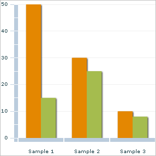
Bar Chart
William PlayfairThis chart is used to compare values across different categories. It is easy to read and understand, making it a popular choice for presenting data.A bar chart is a graphical representation of data that uses rectangular bars to display values. It is commonly used to compare the magnitude or frequency of different categories or groups.- Data Representation: Rectangular bars
- Categories: Horizontal axis
- Magnitude/Frequency: Vertical axis
- Data Types: Numerical or categorical
- Visual Encoding: Length or height of bars
-
247votes
 Urocyon · Public domain
Line Chart
William PlayfairThis chart is used to show trends over time. It is particularly useful for showing changes in data over a long period.A line chart is a graphical representation of data, where data points are plotted and connected by a line. It is commonly used to display trends and patterns over a continuous interval of time or other continuously changing variable. Each data point is represented by a marker on the chart, and the line connects these markers to indicate the overall trend.- Data Representation: Continuous line connecting data points
- Data Type: Numeric or time-based data
- Axes: X-axis for independent variable, Y-axis for dependent variable
- Scale: Variable scale based on data range
- Interpolation: Straight line segments between data points
-
330votes
 Sylvanmoon · CC0
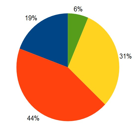
Pie Chart
William PlayfairThis chart is used to show the proportion of different categories in a dataset. It is particularly useful for highlighting the most significant categories.A pie chart is a circular statistical graphic divided into sectors, in which each sector represents a proportionate part of the whole. The arc length of each sector is proportional to the quantity it represents. Pie charts are commonly used to show the percentage distribution of a categorical variable.- Type: Statistical graphic
- Shape: Circular
- Sectors: Divided into multiple sectors
- Representation: Proportional to the quantity
- Common use: Showing percentage distribution
-
422votes
 DanielPenfield · CC BY-SA 3.0
Scatter Plot
Francis GaltonThis chart is used to show the relationship between two variables. It is particularly useful for finding patterns or correlations between different datasets.A scatter plot is a type of chart that displays the relationship between two numerical variables by using dots (or markers) on a coordinate grid. Each dot represents an individual data point with its corresponding values for the two variables. The position of dot along the x-axis corresponds to one variable, while the position along the y-axis corresponds to the other variable. Scatter plots are commonly used to visualize correlations, patterns, or clusters in data.- Display: Dot markers
- Axes: Numerical scale
- X-axis: Independent variable
- Y-axis: Dependent variable
- Trend line: Optional
-
518votes
 StefanPohl, Hi, future humans! (talk · contribs) · CC0
Area Chart
Willard C. BrintonThis chart is used to show the trend of a dataset over time. It is particularly useful for showing changes in data over a long period.The Area Chart is a type of chart used to visualize quantitative data over time. It displays data points as a series of line segments, with the area below the lines filled in with color.- Category: Statistical chart
- Data interpretation: Comparison of data trends over time
- Visualization type: 2D chart
- Data points: Connected by line segments
- Fill area: Colored to represent data values
-
66votes
Bubble Chart
Willard V. OevelenThis chart is used to show the relationship between three variables. It is particularly useful for showing the size of data points and their relationship to other variables.A bubble chart is a type of chart that displays data using bubbles, where the size of each bubble represents a specific value. It is commonly used to show the relationships between three variables, with the x-axis representing one variable, the y-axis representing another variable, and the size of the bubble representing a third variable.- Dimensionality: 2D
- Number of variables: 3
- Primary use: Show relationships between variables
- X-axis: Represents one variable
- Y-axis: Represents another variable
-
73votes
 Tschneidr · CC BY-SA 4.0
Heat Map
Cormac KinneyThis chart is used to show the frequency or density of data points in a dataset. It is particularly useful for showing patterns or correlations in large datasets.A Heat Map is a graphical representation of data where different values are represented using colors. It is used to visualize data across two dimensions, typically presented in a tabular format. The colors in the chart provide instant visual cues, with each color representing a different range or level of data. Heat Maps are particularly useful for displaying large sets of complex data, identifying patterns, and drawing attention to areas with higher values.- Data format: Tabular data
- Visualization type: Color-coded
- Dimensions: 2D
- Color range: Defined by the user or automatically generated
- Color coding: Based on the intensity of the data value
-
85votes
Gantt Chart
Henry GanttThis chart is used to show the timeline of a project. It is particularly useful for showing the different stages of a project and their dependencies.A Gantt chart is a type of bar chart that visually represents the schedule of tasks or activities in a project. It provides a graphical view of the timeline, showing the start and end dates of each task and how they overlap or depend on each other.- Visualization: Bar chart
- Timing: Start and end dates of tasks
- Dependencies: Shows task dependencies
- Overlap: Visualizes overlapping tasks
- Duration: Displays task durations
-
98votes
Waterfall Chart
User:marktaylormqlThis chart is used to show the change in value between different categories. It is particularly useful for showing the cumulative effect of multiple variables.The Waterfall Chart is a visual representation of cumulative values showing how positive or negative changes contribute to a total. It is commonly used in finance and project management to analyze the impact of various elements on an overall outcome.- Purpose: Show cumulative impact of positive and negative changes
- Visual Style: Columns with rising and falling segments
- Axis: Horizontal X-axis represents categories or time, vertical Y-axis represents values
- Start and End Values: Initial value and final total displayed
- Positive Changes: Segments going up represent positive value additions
-
105votes
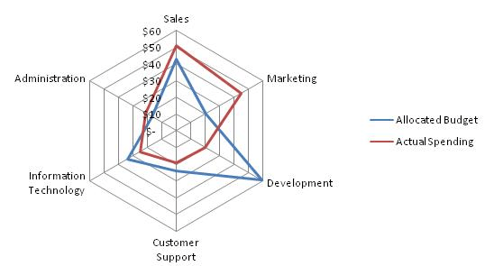 David Clement · Public domainThis chart is used to compare multiple variables across different categories. It is particularly useful for showing the relative performance of different categories.A Radar Chart, also known as a Spider Chart or Star Chart, is a graphical representation of multivariate data. It is used to display multiple variables on a two-dimensional graph, where each variable is represented by a spoke-like axis extending from a central point. The data is plotted as a point or a shape along each axis, and the shape formed by connecting these points represents the data pattern.
- Purpose: Visualize multivariate data patterns
- Number of Axes: Minimum of 3, typically between 3 and 10 axes
- Axis Range: Usually normalized to a common scale
- Axis Labels: Each axis represents a specific variable and is labeled accordingly
- Data Point Placement: Data points are positioned along each axis to represent the variable value

Missing your favorite chart?
Graphs
Discussion
Ranking factors for popular chart
-
Time periodDetermine the specific time frame within which the chart will be analyzing data — daily, weekly, monthly, or yearly. Different periods will yield different popularity rankings, as trends and preferences change over time.
-
Chart typeIdentify the kind of chart you want to create, whether it's for music, movies, books, or any other form of entertainment or product. The criteria for ranking might vary depending on the chart type.
-
Sales dataTrack the number of units sold or the total revenue generated by the items being ranked, often the primary factor in determining popularity.
-
Streaming or viewing dataFor charts involving digital content, such as music, movies, or TV shows, consider the number of streams, views, or downloads each item has received.
-
Audience engagementMeasure the extent to which consumers interact with the content, including social media shares, likes, comments, reviews, and ratings.
-
Geographic locationDecide whether the chart will focus on a specific region or country or take into account global popularity.
-
Market demographicsAssess any target age groups, genders, or other relevant demographics that are relevant to the chart content and factor those into the rankings.
-
Radio airplay or broadcast dataFor music or TV charts, consider the frequency with which songs or shows are played on radio stations or television networks.
-
Critical acclaimFor some charts, critical reviews, ratings, and awards may be considered as factors affecting an item's popularity.
-
Chart methodologyThoroughly outline and consistently apply a clear and transparent methodology for tabulating and weighting the different factors to determine the final rankings.
About this ranking
This is a community-based ranking of the most popular chart. We do our best to provide fair voting, but it is not intended to be exhaustive. So if you notice something or chart is missing, feel free to help improve the ranking!
Statistics
- 2306 views
- 208 votes
- 10 ranked items
Voting Rules
A participant may cast an up or down vote for each chart once every 24 hours. The rank of each chart is then calculated from the weighted sum of all up and down votes.
More information on most popular chart
Charts are an essential part of data visualization. They are used to represent data in a graphical format, making it easier to understand and analyze. There are several types of charts available, each with its own unique features and benefits. However, when it comes to popularity, there are a few charts that stand out from the crowd. In this article, we will explore the most popular charts and their benefits. Whether you're a data analyst, a student, or simply someone who wants to visualize data effectively, this article will provide you with valuable insights into the world of charts.
Explore other rankings
Check out some of the other recommended rankings on StrawPoll and make your voice heard.