The Most Beautiful Graph, Ranked
Voting rules: Choose the graph you think is the most beautiful!

Updated on Jul 20, 2024 06:21
Graphs are essential tools for expressing complex quantitative information in a visually engaging manner. Determining which graph stands out in terms of beauty can provide insights into what makes data presentation most effective and appealing. This is where your input becomes invaluable, helping to identify which graphs not only convey information accurately but also captivate and inform.
By participating in this voting process, you contribute to a broader understanding of excellent data visualization practices. Your votes help shape a dynamic listing, reflecting popular opinions on aesthetic excellence in graph design. This process is not only about preference but also about appreciating the art and science behind these informative tools.
What Is the Most Beautiful Graph?
-
12points

Barnsley Fern
A fractal that resembles the black spleenwort fern and is generated using a random iterative algorithm.- Discovered By: Michael Barnsley
- Year: 1981
-
22points

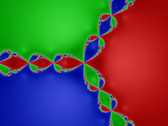
Mandelbrot Set
A complex mathematical set of points that forms a fractal, creating stunning, infinitely detailed patterns.- Discovered By: Benoit Mandelbrot
- Year: 1978
-
30points
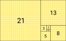
Fibonacci Spiral
An approximation of the golden spiral created by drawing circular arcs connecting the opposite corners of squares in the Fibonacci tiling.- Related To: Fibonacci Numbers
- Discovered By: Leonardo of Pisa (Fibonacci)
-
40points
Newton Fractal
A boundary set in the complex plane which is characterized by a fractal structure that emerges from Newton's method for complex polynomials.- Related To: Newton's Method
- Field: Complex Analysis
-
50points
Euler's Identity
An equality found in mathematics that has been cited as an example of mathematical beauty, combining five fundamental mathematical constants.- Formula: e^(iπ) + 1 = 0
- Discovered By: Leonhard Euler
-
60points
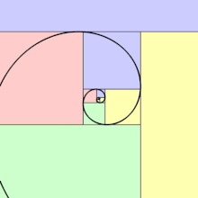
Golden Ratio Spiral
A logarithmic spiral whose growth factor is φ, the golden ratio, embodying a form of aesthetic simplicity and harmony.- Symbol: φ
- Approximate Value: 1.618033988749895
-
70points

Koch Snowflake
A mathematical curve and one of the earliest fractal curves to have been described, known for its infinite perimeter and finite area.- Discovered By: Helge von Koch
- Year: 1904
In other topics -
80points
Fourier Transform
A mathematical transform that decomposes functions depending on space or time into functions depending on spatial or temporal frequency.- Introduced By: Joseph Fourier
- Year: 1822
-
90points
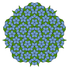
Penrose Tiling
A non-periodic tiling generated by an aperiodic set of prototiles named after mathematician and physicist Roger Penrose.- Discovered By: Roger Penrose
- Year: 1974
-
100points
Lorenz Attractor
A set of chaotic solutions to the Lorenz system which, when plotted, resemble a butterfly or figure eight.- Discovered By: Edward Lorenz
- Year: 1963
Missing your favorite graph?
Graphs
Error: Failed to render graph
Discussion
No discussion started, be the first!
About this ranking
This is a community-based ranking of the most beautiful graph. We do our best to provide fair voting, but it is not intended to be exhaustive. So if you notice something or graph is missing, feel free to help improve the ranking!
Statistics
- 2566 views
- 4 votes
- 10 ranked items
Voting Rules
A participant may cast an up or down vote for each graph once every 24 hours. The rank of each graph is then calculated from the weighted sum of all up and down votes.
Trendings topics
Don't miss out on the currently trending topics of StrawPoll Rankings!
Data Visualization
Aesthetics
Additional Information
More about the Most Beautiful Graph
Rank #1 for the most beautiful graph: Barnsley Fern (Source)
Graphs are visual tools that help us understand data. They show relationships between different sets of information. When a graph is well-designed, it can be both informative and beautiful. Beauty in graphs comes from clarity, simplicity, and elegance.
A beautiful graph often has a clean design. It avoids clutter and unnecessary details. This makes it easy to read and understand. The use of color and shapes is important. Colors should be chosen carefully to highlight key points. Shapes and lines should be clear and distinct. This helps the viewer focus on the important parts of the graph.
The layout of a graph matters too. A good layout guides the viewer’s eyes through the information. It presents data in a logical order. This makes the story the data tells easy to follow. A well-laid-out graph can reveal patterns and trends that might not be obvious at first glance.
Graphs can also be beautiful when they make complex data simple. They can take large amounts of information and present it in a way that is easy to grasp. This involves breaking down data into smaller, more manageable parts. It also involves highlighting the most important points. This helps the viewer understand the data quickly and easily.
The choice of graph type is important. Different types of graphs are suited to different kinds of data. For example, bar graphs are good for comparing quantities. Line graphs are good for showing trends over time. Pie charts are good for showing proportions. Choosing the right type of graph makes the data clearer and more meaningful.
The best graphs also tell a story. They don’t just present data; they explain it. They show how different pieces of information relate to each other. They highlight important points and trends. They help the viewer see the bigger picture. This storytelling aspect is what makes a graph not just informative, but also compelling.
Graphs can be beautiful when they are accurate. Accuracy is crucial in data representation. A graph should present data truthfully and without distortion. This builds trust with the viewer. An accurate graph is a reliable source of information. It allows the viewer to make informed decisions based on the data.
Graphs also benefit from good labeling. Labels should be clear and concise. They should explain what the data represents. This includes titles, axis labels, and legends. Good labeling helps the viewer understand the graph without confusion.
In summary, a beautiful graph is one that is clear, simple, and elegant. It uses color and shapes effectively. It has a logical layout that guides the viewer’s eyes. It makes complex data simple. It tells a story and highlights important points. It is accurate and well-labeled. When all these elements come together, a graph can be both informative and beautiful.
Explore other rankings
Check out some of the other recommended rankings on StrawPoll and make your voice heard.