The Most Difficult Color, Ranked
Voting rules: Choose the color you think is the most difficult!

Updated on Jul 24, 2024 06:29
Choosing colors for various purposes can sometimes pose unexpected challenges, especially when one considers how certain hues can be perplexing or tough to describe accurately. It's common for artists, designers, and even everyday decision-makers to grapple with the complexity of a color that defies simple categorization. Finding consensus or even a broad understanding of these nuanced shades can be a worthy endeavor.
Here, users are given the opportunity to cast their votes on which color they find the most difficult to pinpoint or describe. This process not only aids in demystifying these elusive hues but also contributes to a shared resource that helps others in identifying and understanding the most complex colors. Your votes shape an ongoing, community-driven ranking that illuminates the subtleties of color perception.
What Is the Most Difficult Color?
-
11points
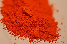
Cadmium Red
A bright, intense red pigment that was discovered in the early 20th century.- Discovery: Early 20th Century
- Toxicity: Highly toxic
In other topics -
2points
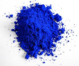
YInMn Blue
A vibrant blue pigment discovered accidentally in 2009.- Discovery Year: 2009
- Components: Yttrium, Indium, Manganese
-
30points
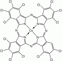
Phthalo Green
A synthetic green pigment known for its intensity and strong tinting strength.- Intensity: Very high
- Tinting Strength: Strong
-
40points
Chrome Yellow
A bright yellow pigment that was widely used in the 19th century but is known for its toxicity.- Toxicity: Highly toxic
- Historical Use: Vincent van Gogh's sunflowers
-
50points

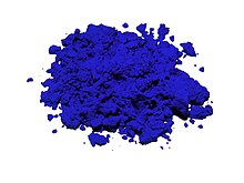
International Klein Blue (IKB)
A deep blue hue first mixed by the artist Yves Klein.- Inventor: Yves Klein
- Year: 1950s
In other topics -
60points
Ultramarine
Originally made by grinding lapis lazuli into a powder to create a rich blue pigment.- Origin: Afghanistan's lapis lazuli mines
- Historical Importance: Valued more than gold in the Renaissance
-
70points

Titanium White
The most widely used white pigment because of its brightness and very high refractive index.- Composition: Titanium dioxide
- Popularity: Most widely used white pigment
-
80points

Burnt Sienna
A rich brown pigment made by heating raw sienna, which increases its color intensity and alters its hue.- Process: Heating raw sienna
- Color Change: Increases color intensity and alters hue
-
90points

Vantablack
Known as one of the darkest substances, absorbing up to 99.965% of visible light.- Composition: Vertically aligned carbon nanotube arrays
- Creator: Surrey NanoSystems
-
100points
Quinacridone Magenta
A synthetic pigment used widely since its introduction in the 1950s for its bright, clean magenta color.- Introduction Year: 1950s
- Characteristics: Bright, clean magenta color
In other topics
Missing your favorite color?
Graphs
Error: Failed to render graph
Discussion
No discussion started, be the first!
About this ranking
This is a community-based ranking of the most difficult color. We do our best to provide fair voting, but it is not intended to be exhaustive. So if you notice something or color is missing, feel free to help improve the ranking!
Statistics
- 2092 views
- 1 votes
- 10 ranked items
Voting Rules
A participant may cast an up or down vote for each color once every 24 hours. The rank of each color is then calculated from the weighted sum of all up and down votes.
Trendings topics
Don't miss out on the currently trending topics of StrawPoll Rankings!
Perception
Art and Design
Additional Information
More about the Most Difficult Color
Rank #1 for the most difficult color: Cadmium Red (Source)
Color perception varies from person to person. The human eye can see millions of colors, but some are harder to perceive than others. This difficulty arises from several factors, such as the way light interacts with objects, how our eyes detect light, and how our brains process these signals.
Light consists of different wavelengths. When light hits an object, some wavelengths absorb, and others reflect. The reflected wavelengths determine the color we see. Our eyes have cells called cones that detect these wavelengths. There are three types of cones, each sensitive to different ranges of light. When light hits these cones, they send signals to the brain, which then interprets them as colors.
Some colors fall between the sensitivity ranges of these cones. This makes them harder to distinguish. When the cones do not receive clear signals, the brain struggles to interpret the color. This can make some colors appear similar to others, causing confusion.
The environment also affects color perception. Lighting conditions, such as natural sunlight or artificial light, can change how colors appear. Colors may look different in the morning compared to the evening. Shadows and reflections can also alter perception. This variability adds to the difficulty of perceiving certain colors.
Cultural and linguistic factors influence how we perceive and describe colors. Different cultures have unique ways of categorizing and naming colors. Some languages have many words for colors, while others have few. This affects how people from different cultures perceive and distinguish colors. Without specific terms, it becomes harder to identify and discuss certain colors.
Color blindness is another factor. It affects a significant portion of the population. People with color blindness have difficulty distinguishing certain colors. This condition results from anomalies in the cones or their absence. Those affected may see a limited range of colors, making some colors nearly impossible to perceive.
Technology and design also play roles. Digital screens and printed materials use different methods to create colors. Screens use a combination of red, green, and blue light, while printers use cyan, magenta, yellow, and black inks. These methods can produce colors that are difficult to replicate accurately. This inconsistency can make certain colors appear different across various devices and media.
Artists and designers often face challenges when working with these difficult colors. They must consider how colors interact and how viewers will perceive them. They use techniques like contrast and shading to make these colors more distinguishable. Despite their efforts, some colors remain elusive and hard to work with.
In conclusion, the perception of difficult colors involves a complex interplay of biological, environmental, cultural, and technological factors. Understanding these factors can help us appreciate the challenges of color perception and the efforts to overcome them. While some colors will always be harder to perceive, awareness of these difficulties allows us to navigate the colorful world with greater insight.
Explore other rankings
Check out some of the other recommended rankings on StrawPoll and make your voice heard.