The Most Dramatic Font, Ranked
Voting rules: Choose the font you think is the most dramatic!

Updated on Jul 24, 2024 06:33
Designers understand that the right font can carry a load of emotion and intent, transforming plain text into a powerful message. This feature is ever so crucial in areas where drama is requisite, shaping narratives or drawing audience attention. Selecting the optimal dramatic font is not merely a matter of aesthetic preference, but a foundational aspect of effective communication and design.
By participating in the ranking of dramatic fonts, contributors aid in clarifying which fonts most effectively encapsulate drama and impact. Each vote cast in this online poll pushes certain fonts closer to the spotlight, directly influencing how future narratives are shaped. This community-driven approach ensures the ranking stays relevant and reflective of current tastes and practical uses.
What Is the Most Dramatic Font?
-
148points
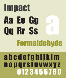
Impact
Impact is a sans-serif typeface designed to make an impression with its strong, bold strokes and compressed letters.- Usage: Widely used for memes and attention-grabbing headlines.
-
29points
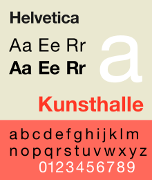
Helvetica Bold
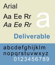
Helvetica Bold is a widely used sans-serif typeface known for its clarity and versatility, with a presence that commands attention.- Adoption: One of the most popular fonts in the world, used in thousands of brand logos.
-
31points
Playfair Display
Playfair Display is a high-contrast serif font with a dramatic and bold style, ideal for headlines and editorial work.- Inspiration: Designed with inspiration from the 18th-century letterforms.
-
40points
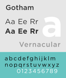
Gotham Bold
Gotham Bold is a geometric sans-serif font known for its clean, modern lines and impactful presence.- Popularity: Popular in professional and political branding.
-
50points
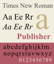
Times New Roman Bold
Times New Roman Bold is a serif font that adds weight and authority to any text, making it a classic choice for formal documents.- History: Originally designed for The Times newspaper in London.
-
60points
Arial Black
Arial Black is a grotesque sans-serif typeface known for its extra-bold weight, making it stand out in any setting.- Usage: Commonly used for headlines and titles where clarity and impact are required.
-
70points
Rockwell Bold
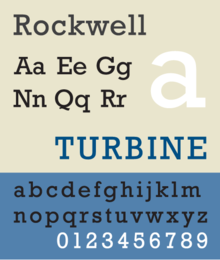
Rockwell Bold is a slab serif font with a strong and sturdy character, great for making a solid statement.- Features: Notable for its square or geometric appearance and thick serifs.
-
80points
Garamond Bold
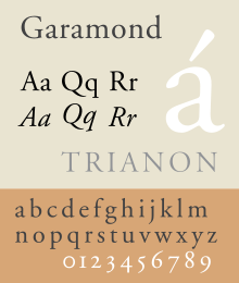
Garamond Bold is an elegant and classic serif font that brings a touch of drama and sophistication to any text.- Origin: Based on the designs of 16th-century French engraver Claude Garamond.
-
90points
Bebas Neue
Bebas Neue is a tall, sans-serif font that is bold and impactful, making it great for headlines and posters.- Characteristic: Known for its high caps and tight letter spacing.
-
100points
Futura Bold
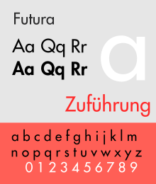
Futura Bold is a geometric sans-serif font known for its efficiency and forwardness, often used in fashion and advertising.- Design: Characterized by its geometric shapes and near-even weight distribution.
Missing your favorite font?
Graphs
Error: Failed to render graph
Discussion
No discussion started, be the first!
About this ranking
This is a community-based ranking of the most dramatic font. We do our best to provide fair voting, but it is not intended to be exhaustive. So if you notice something or font is missing, feel free to help improve the ranking!
Statistics
- 3338 views
- 58 votes
- 10 ranked items
Voting Rules
A participant may cast an up or down vote for each font once every 24 hours. The rank of each font is then calculated from the weighted sum of all up and down votes.
Additional Information
More about the Most Dramatic Font
Rank #1 for the most dramatic font: Impact (Source)
Typography has always played a key role in design and communication. Among the many styles of fonts, some stand out due to their dramatic flair. These fonts capture attention and evoke strong emotions. They are often bold, intricate, and full of character.
Dramatic fonts often feature exaggerated features. They may have large, sweeping curves or sharp, angular lines. These elements create a sense of movement and energy. When used in headlines or logos, they make a strong statement. Their unique shapes and forms draw the eye and hold the viewer's attention.
The history of dramatic fonts dates back to early printing presses. Printers and typographers experimented with different styles to make their work stand out. Over time, these experiments led to the creation of more elaborate and ornate typefaces. These fonts were used in posters, book covers, and advertisements to grab the audience's attention.
In the digital age, the use of dramatic fonts has only increased. Designers have more tools at their disposal to create stunning, eye-catching typefaces. With the rise of social media and digital marketing, the need for attention-grabbing fonts has grown. Dramatic fonts help brands stand out in a crowded market. They convey a sense of uniqueness and creativity.
Choosing a dramatic font requires careful consideration. The font must match the tone and message of the content. A dramatic font can add emphasis and impact, but it can also overwhelm if used improperly. Balance is key. Pairing a dramatic font with a simpler one can create a harmonious design.
Dramatic fonts are also versatile. They can be used in various contexts, from fashion magazines to movie posters. Their bold, striking nature makes them suitable for any medium where impact is needed. However, they should be used sparingly. Overuse can lead to a cluttered and confusing design.
The creation of a dramatic font is an art form. Designers spend countless hours refining each letter. They consider how each character interacts with the others. The goal is to create a cohesive and visually appealing typeface. This process requires a deep understanding of typography and design principles.
Despite their bold appearance, dramatic fonts are not just about aesthetics. They also communicate a message. The choice of font can influence how the audience perceives the content. A dramatic font can convey seriousness, excitement, or elegance. It adds an extra layer of meaning to the text.
In conclusion, dramatic fonts are a powerful tool in design. They capture attention, evoke emotions, and enhance the overall impact of the content. Their history is rich, and their use continues to evolve in the digital age. When used thoughtfully, they can elevate a design and leave a lasting impression.
Explore other rankings
Check out some of the other recommended rankings on StrawPoll and make your voice heard.