The Most Popular Font for Advertising, Ranked
Voting rules: Choose the font you think is the most popular!

Updated on Jul 23, 2024 06:51
Choosing the right font for an advertising campaign can significantly impact its effectiveness and audience engagement. Fonts convey not only information but also mood and style, influencing how consumers perceive the message. With numerous options available, it can be a challenge for designers and marketers to select one that best fits their project needs.
By participating in the voting process for the most popular advertising fonts, users contribute to a collective insight beneficial to the community. This ranking not only helps highlight which fonts are currently resonating with audiences but also aids in identifying trends and preferences in design. Your input ensures the most practical and appealing choices rise to the top, helping others in their future creative endeavors.
What Is the Most Popular Font for Advertising?
-
129points
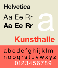
Helvetica
A widely used sans-serif typeface developed in 1957, known for its clarity, simplicity, and neutrality.- Designer: Max Miedinger with Eduard Hoffmann
In other topics -
221points
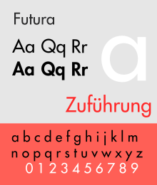
Futura
A geometric sans-serif typeface designed in 1927, celebrated for its modernity and clean shapes.- Designer: Paul Renner
In other topics -
319points
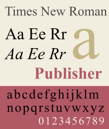
Times New Roman
A serif typeface designed for The Times newspaper in 1931, known for its readability in body text.- Designer: Stanley Morison, Victor Lardent
In other topics -
412points
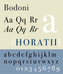
Bodoni
A series of serif typefaces first designed in 1798, known for its dramatic contrast between thick and thin lines.- Designer: Giambattista Bodoni
-
512points
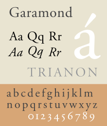
Garamond
A group of many old-style serif typefaces, named after the 16th-century Parisian engraver Claude Garamond.- Origin: 16th Century
In other topics -
610points
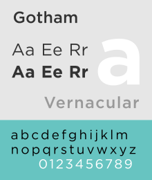
Gotham
A geometric sans-serif typeface designed in 2000, widely used in political campaigns and corporate logos.- Designer: Tobias Frere-Jones
-
76points
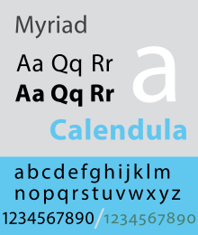
Myriad
A humanist sans-serif typeface designed in 1992, known for its warmth and clarity.- Designer: Robert Slimbach and Carol Twombly
-
80points
Bebas Neue
A free, all caps sans-serif typeface originally designed in 2010, known for its clean lines and modern appeal, often used in headlines.- Designer: Ryoichi Tsunekawa
-
90points
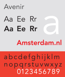
Avenir
A geometric sans-serif typeface designed in 1988, inspired by Futura but with a more organic appearance.- Designer: Adrian Frutiger
In other topics -
100points
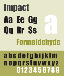
Impact
A sans-serif typeface designed in 1965, known for its condensed letters and tight spacing, making it impactful for headlines.- Designer: Geoffrey Lee
In other topics
Missing your favorite font?
Graphs
Error: Failed to render graph
Discussion
No discussion started, be the first!
About this ranking
This is a community-based ranking of the most popular font for advertising. We do our best to provide fair voting, but it is not intended to be exhaustive. So if you notice something or font is missing, feel free to help improve the ranking!
Statistics
- 2077 views
- 109 votes
- 10 ranked items
Voting Rules
A participant may cast an up or down vote for each font once every 24 hours. The rank of each font is then calculated from the weighted sum of all up and down votes.
Additional Information
More about the Most Popular Font for Advertising
Rank #1 for the most popular font for advertising: Helvetica (Source)
The world of advertising relies on many elements to grab attention. One key element is the choice of font. The right font can make or break an ad. It sets the tone and conveys the message clearly. Over time, one font has emerged as a favorite in the advertising industry.
This font is known for its clean lines. It is easy to read both up close and from a distance. Designers love it because it blends well with many styles. It works for bold headlines and fine print alike. Its versatility makes it suitable for various products and services. From tech gadgets to luxury goods, this font fits all.
The font's design is simple yet effective. It avoids unnecessary flourishes. Instead, it focuses on clarity and impact. This makes it ideal for catching the eye quickly. In a world filled with distractions, this is crucial. The font's simplicity does not mean it is boring. On the contrary, it stands out because it is straightforward.
Another reason for its popularity is its adaptability. It looks good in different weights and sizes. Whether used in light, regular, or bold, it maintains its appeal. This flexibility allows designers to create a cohesive look. They can use the same font throughout an ad campaign, ensuring consistency.
The font also has a modern feel. It reflects the current trends without being too trendy. This balance makes it timeless. It does not go out of style, which is important for long-term campaigns. Brands can use it for years without looking outdated.
Its popularity is not limited to print ads. It works well on digital platforms too. On websites, social media, and mobile apps, this font remains legible. This cross-platform compatibility is a big plus. In today's digital age, ads need to work across various media.
The font's design also includes a wide range of characters. This makes it suitable for different languages and regions. Global brands find this feature particularly useful. They can maintain a consistent look in all markets. This helps in building a strong, recognizable brand identity.
In addition to its visual appeal, the font is also functional. It supports various file formats and software. This makes it easy to use in different design programs. Designers can work efficiently, saving time and resources.
The font's success is not a coincidence. It is the result of thoughtful design and practical features. It meets the needs of modern advertising. Its clean lines, simplicity, and versatility make it a top choice. Brands and designers trust it to deliver their message effectively.
This font has set a high standard in the industry. It proves that less can be more. By focusing on clarity and impact, it achieves maximum effect. It is a testament to the power of good design. In the fast-paced world of advertising, this font remains a reliable tool. It continues to be the go-to choice for many, and for good reason.
Explore other rankings
Check out some of the other recommended rankings on StrawPoll and make your voice heard.